documentdb
Khóa học miễn phí DocumentDB – Visualize Data nhận dự án làm có lương
DocumentDB – Visualize Data
In this chapter, we will learn how to visualize data which is stored in DocumentDB. Microsoft provided Power BI Desktop tool which transforms your data into rich visuals. It also enables you to retrieve data from various data sources, merge and transform the data, create powerful reports and visualizations, and publish the reports to Power BI.
In the latest version of Power BI Desktop, Microsoft has added support for DocumentDB as well in which you can now connect to your DocumentDB account. You can download this tool from the link,
Let’s take a look at an example in which we will visualize the earthquakes data imported in the last chapter.
Step 1 − Once the tool is downloaded, launch the Power BI desktop.
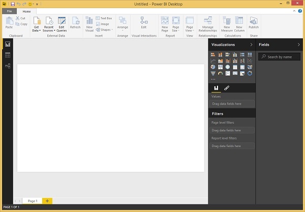
Step 2 − Click ‘Get Data’ option which is on the Home tab under External Data group and it will display the Get Data page.
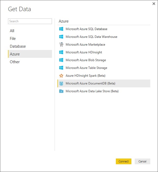
Step 3 − Select the Microsoft Azure DocumentDB (Beta) option and click ‘Connect’ button.
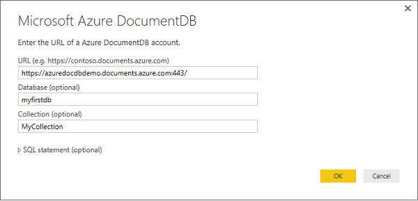
Step 4 − Enter the URL of your Azure DocumentDB account, Database and Collection from which you want visualize data and press Ok.
If you are connecting to this endpoint for the first time, you will be prompted for the account key.
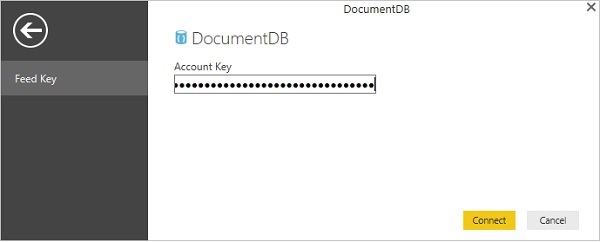
Step 5 − Enter the account key (primary key) which is unique for each DocumentDB account available on Azure portal, and then click Connect.
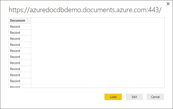
When the account is successfully connected, it will retrieve the data from specified database. The Preview pane shows a list of Record items, a Document is represented as a Record type in Power BI.
Step 6 − Click ‘Edit’ button which will launch the Query Editor.
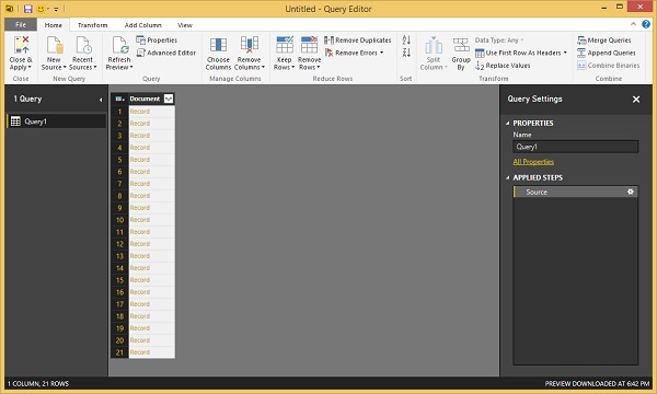
Step 7 − In the Power BI Query Editor, you should see a Document column in the center pane, click on the expander at the right side of the Document column header and select the columns which you want display.
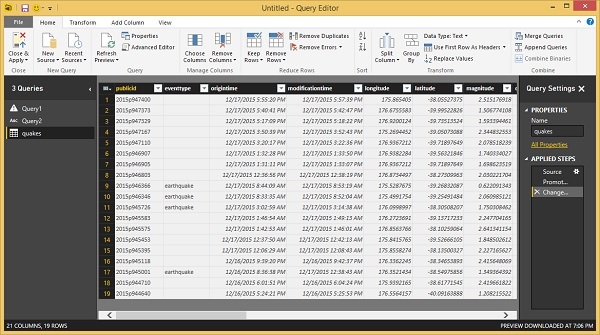
As you can see that we have latitude and longitude as separate column but we visualize data in latitude, longitude coordinates form.
Step 8 − To do that, click ‘Add Column’ tab.
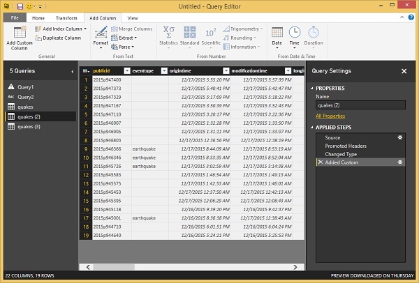
Step 9 − Select the Add Custom Column which will display the following page.
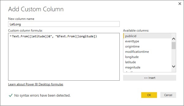
Step 10 − Specify the new column name, let’s say LatLong and also the formula which will combine the latitude and longitude in one column separated by a comma. Following is the formula.
Text.From([latitude])&", "&Text.From([longitude])
Step 11 − Click OK to continue and you will see that the new column is added.
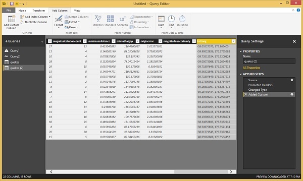
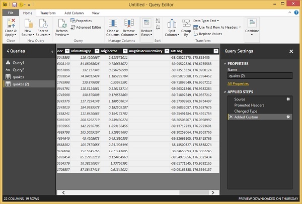
Step 12 − Go to the Home tab and click ‘Close & Apply’ option.
Step 13 − You can create reports by dragging and dropping fields into the Report canvas. You can see on the right, there are two panes − one Visualizations pane and the other is Fields pane.
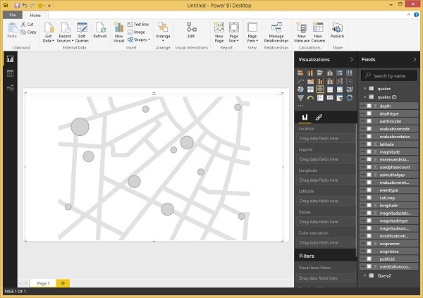
Let’s create a map view showing the location of each earthquake.
Step 14 − Drag the map visual type from the Visualizations pane.
Step 15 − Now, drag and drop the LatLong field from the Fields pane to the Location property in Visualizations pane. Then, drag and drop the magnitude field to the Values property.
Step 16 − Drag and drop the depth field to the Color saturation property.
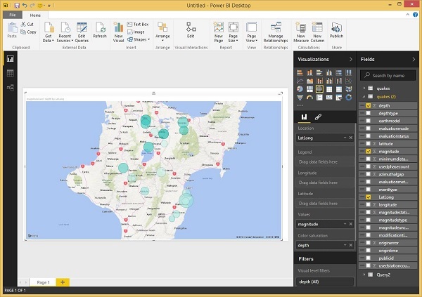
You will now see the Map visual showing a set of bubbles indicating the location of each earthquake.
Khóa học lập trình tại Toidayhoc vừa học vừa làm dự án vừa nhận lương: Khóa học lập trình nhận lương tại trung tâm Toidayhoc
Notice: Trying to access array offset on value of type bool in /home/edua/htdocs/edu.toidayhoc.com/wp-content/themes/flatsome/flatsome/inc/shortcodes/share_follow.php on line 41
